

UX/UI Case Study
An intuitive app experience for wine lovers to discover events, venues, and their next favorite pour.
My Role: UX/UI Designer | Duration: 24 weeks
Tools Used: Balsamiq, Figma, Adobe Illustrator, Adobe Photoshop, Microsoft Word, Skype


Problem Statement
There’s no single platform that helps wine enthusiasts easily discover local events or connect with others who share their interests. Existing information is fragmented, making exploration and community building challenging.
Possible Solution
Design a user-centered mobile experience that brings together wine events, venues, and communities into one seamless, intuitive platform.
The Design Process
My process followed a user-centered approach, uncovering insights, defining needs, and designing a seamless experience from concept to final interface.
Discover
User Research & Interviews
Define
Personas & Requirements
Ideate
Concept Sketches & Storyboard
Design
Interface & Interaction Design
Test
Usability Feedback
Discover Phase
User Research
To better understand how wine enthusiasts discover new events and connect with others, I conducted one-on-one contextual interviews with three participants. The goal was to identify common motivations, behaviors, and frustrations in their discovery process.
User Interviews
I interviewed five participants who regularly enjoy wine in social settings to understand how they find and engage with wine-related events. Sample Questions:
Can you tell me about your experience with wine and what aspects of it you enjoy the most?
What are some of the biggest challenges you face when trying to discover new wine experiences?
If you could design the perfect platform or service for wine enthusiasts like yourself, what features would it include?
Key Interview Insights
Wine enhances social connection.
Convenience drives participation.
Discovery often happens through word of mouth.
Food pairings elevate the experience.
Local exploration feels more accessible than travel.
Define Phase
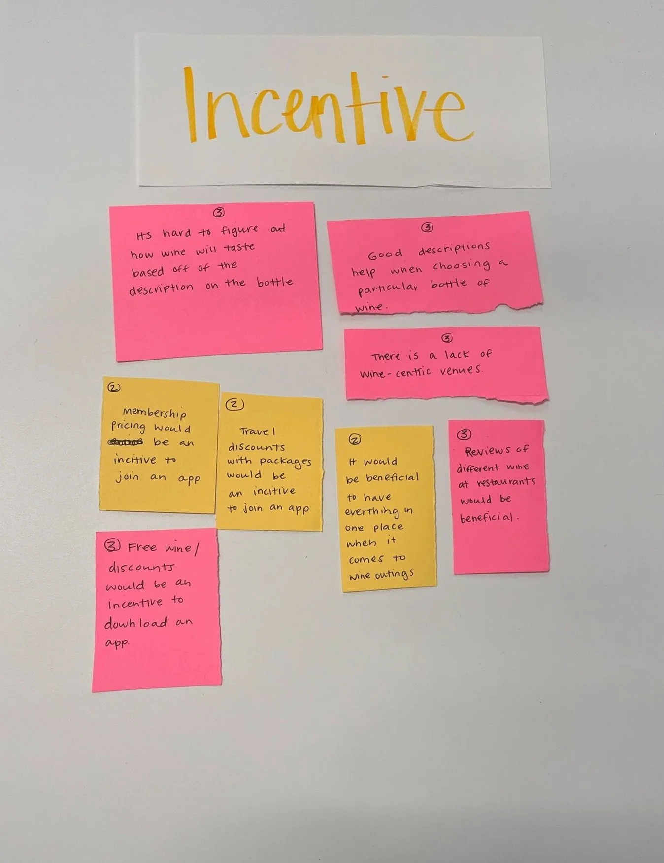
Affinity Diagram
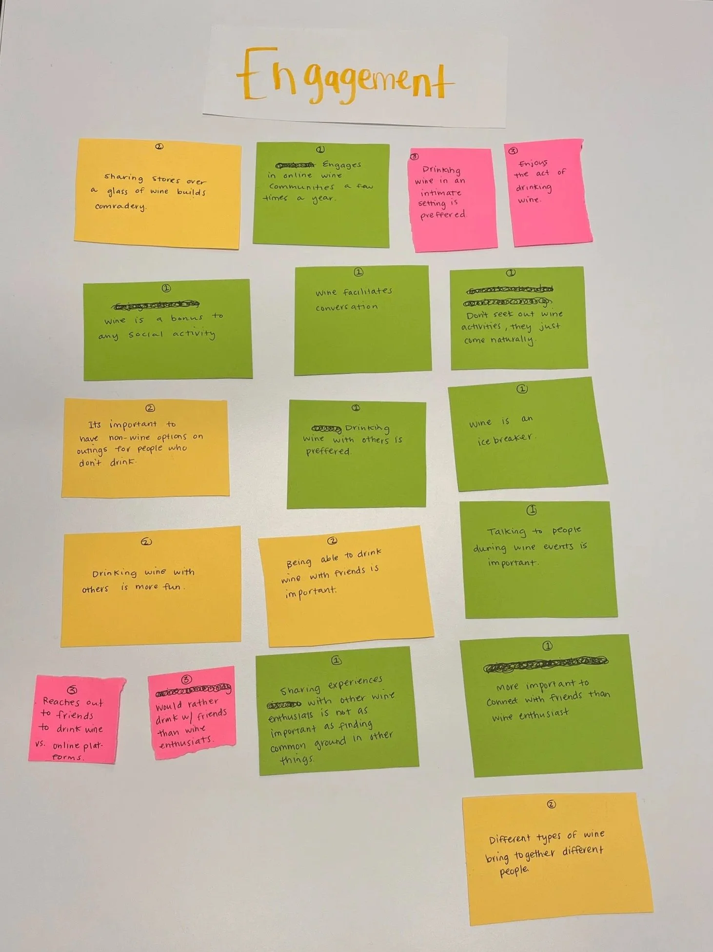
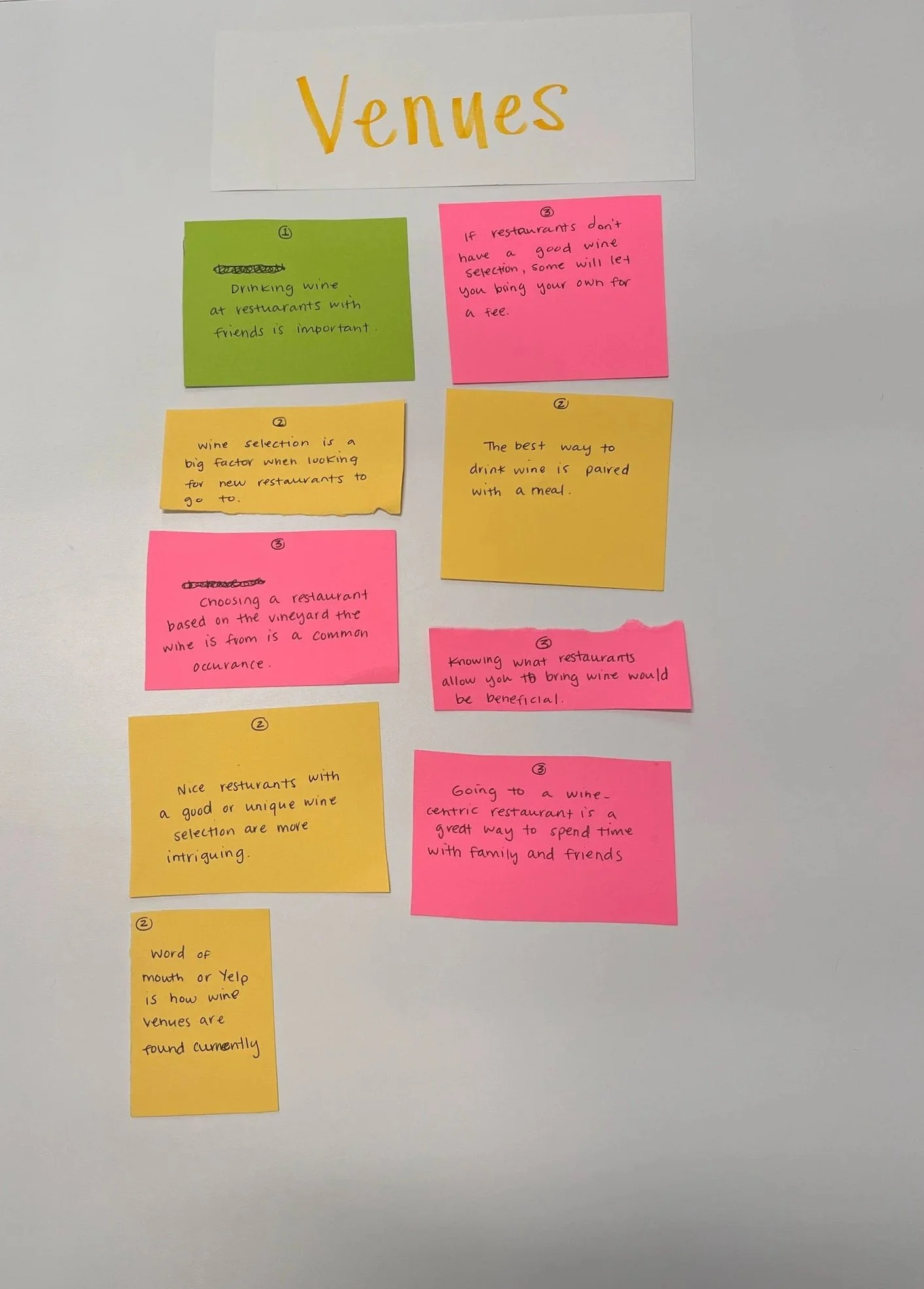
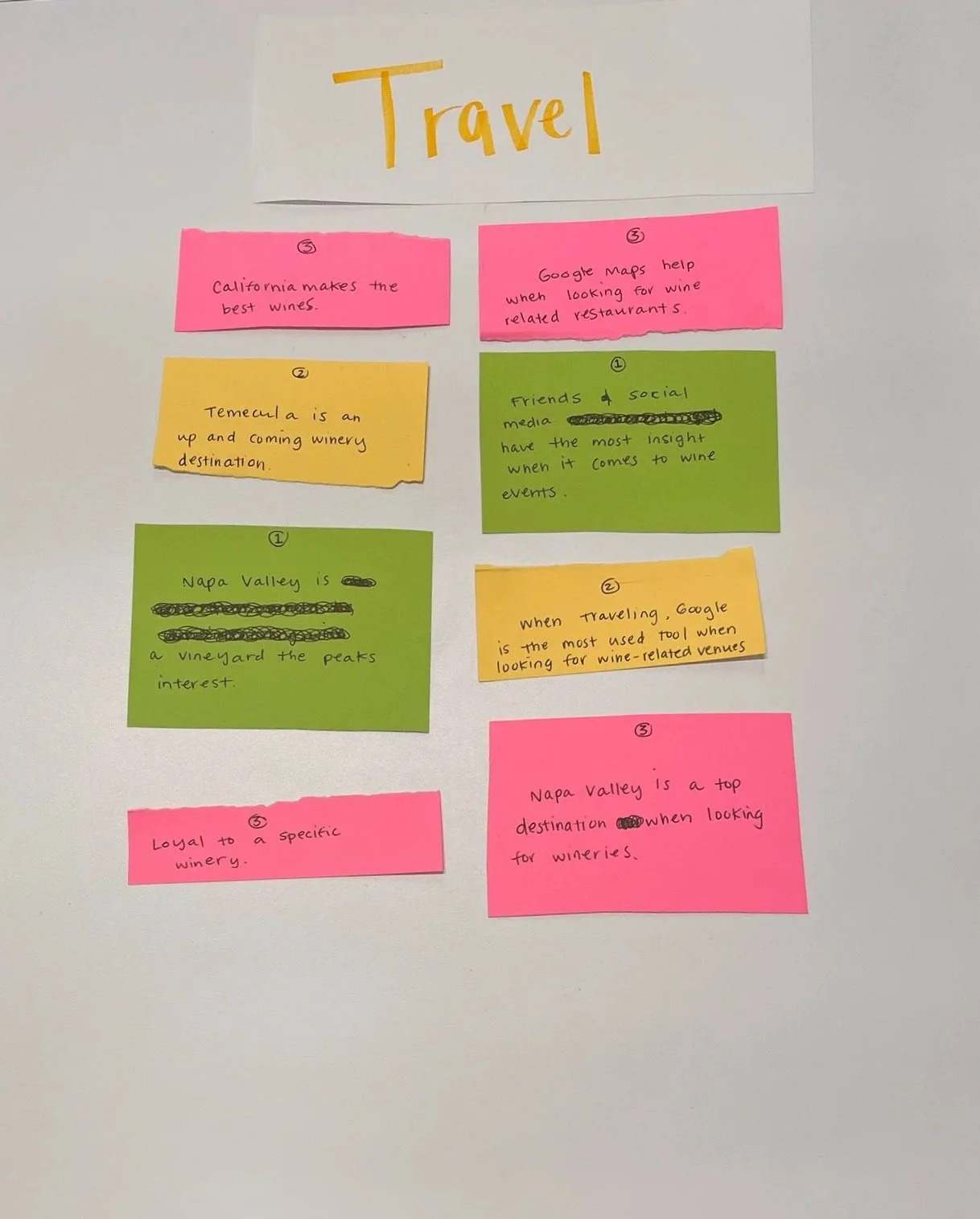
After reviewing interview transcripts, notes, and observations, I created an Affinity Diagram to identify recurring themes in user behaviors and pain points. By clustering related insights, I uncovered key patterns around how wine enthusiasts discover events, connect socially, and what factors influence their participation. These clusters helped define the foundation for my user persona and informed design priorities moving forward.
User Personas
Based on the insights gathered from my interviews, I developed a persona representing the typical WineFix user. Creating this persona helped translate qualitative data into a relatable character — clarifying user goals, frustrations, and motivations to guide design decisions throughout the project.
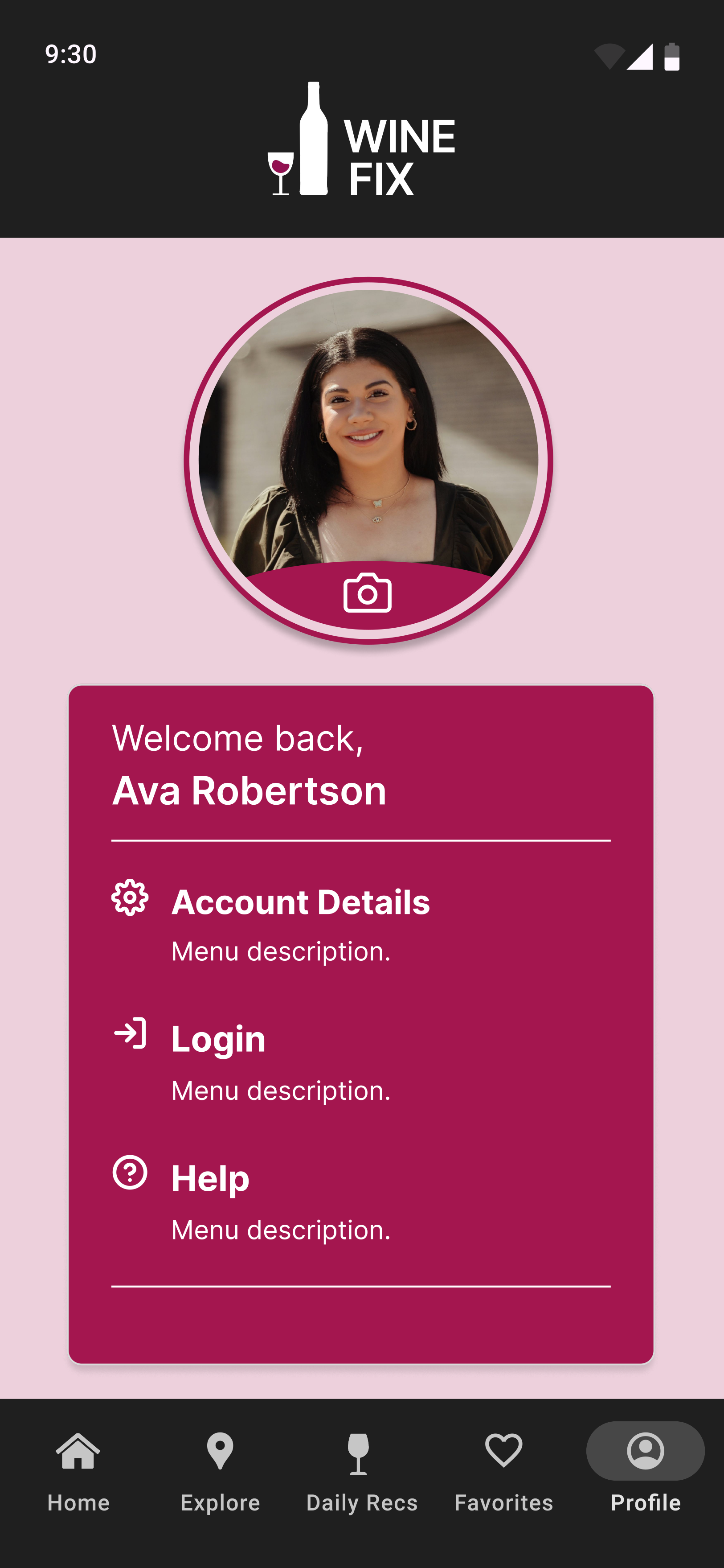
Ava Robertson
Age: 35 | Gender: Female | Occupation: Marketing Manager | Location: San Francisco, CA |
Ava is a 35-year-old marketing manager from San Francisco who thrives on connection and shared experiences. She loves discovering new restaurants and wineries, often organizing wine tastings and dinners with friends. While she enjoys wine, her real passion lies in the social and cultural experiences surrounding it.
Tech-savvy and resourceful, Ava uses Google and social media to find new wine spots, but often feels frustrated by scattered and unreliable information. She values convenience, authenticity, and deals that make her outings more accessible. Ava envisions a platform that helps her discover new venues, plan effortlessly with friends, and make every glass of wine part of a memorable shared experience.
Frustrations:
Difficulty finding reliable and comprehensive info about local wine venues
Challenges in organizing group outings and aligning schedules
Frustration with the lack of personalized recommendations and deals
Goals:
Discover new and interesting wine venues and events
Have seamless and enjoyable experiences when planning wine outings
Create memorable social experiences around wine
User Requirements
From Ava’s goals and frustrations, I defined key user requirements to guide the app’s design. These requirements focus on usability, personalization, and social connection — ensuring Wine Fix delivers a seamless, engaging experience for wine enthusiasts.
Structured Navigation
Event Calendar Integration
Local Venue Details
Personalized Recommendations
User Reviews & Ratings
Ideate Phase
With user insights and requirements defined, I began brainstorming how Wine Fix could bring together discovery, personalization, and community in one seamless experience. Through quick sketches and concept exploration, I merged several early ideas — including the homepage, map view, and personalized recommendations — into a single, intuitive flow.
User feedback reinforced this direction, showing that combining profile customization with real-time venue discovery created a more personal and engaging journey.
Early Sketches
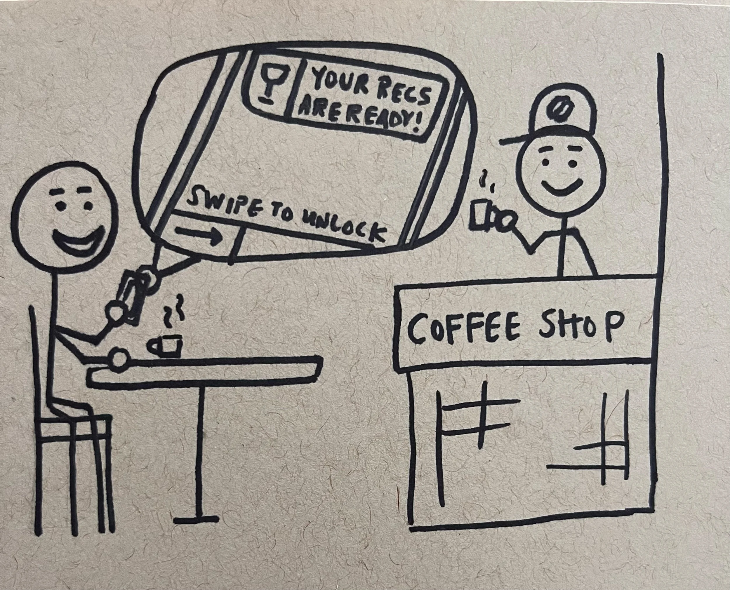
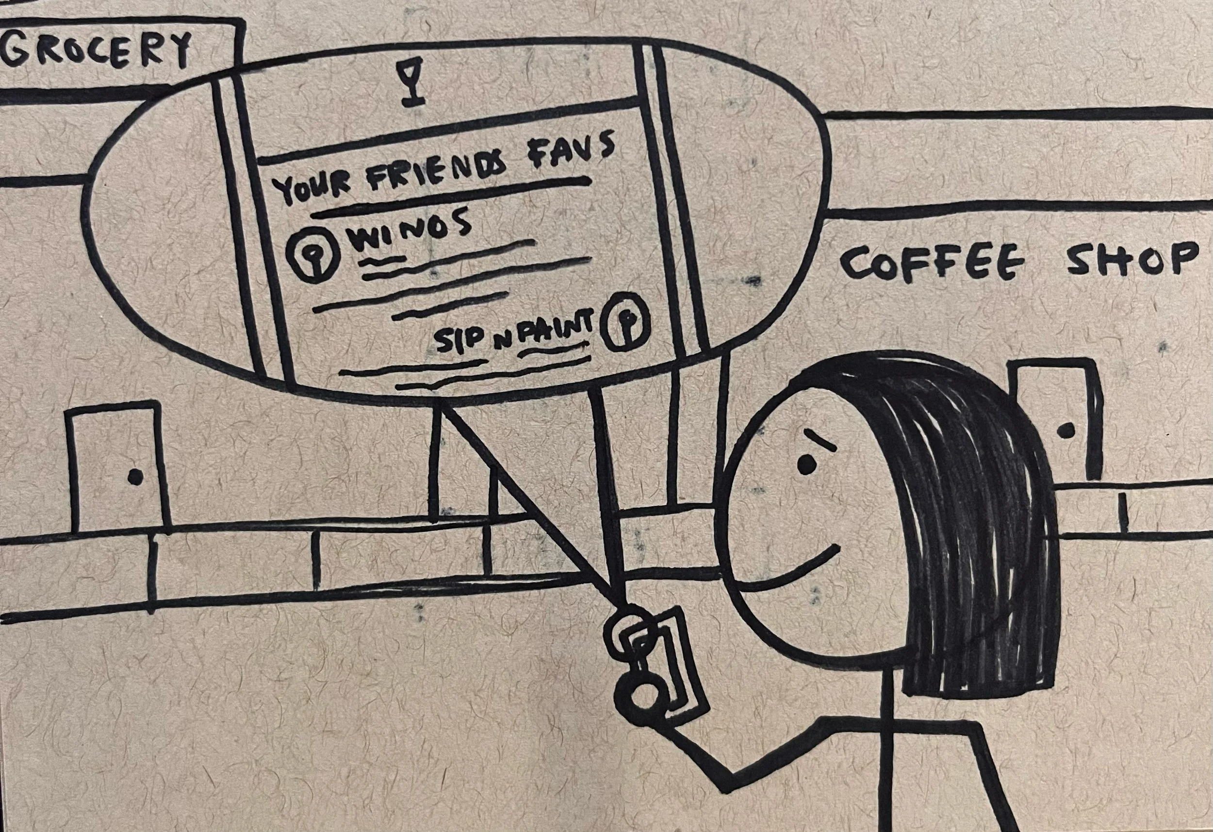
To visualize the user’s interaction with the app, I developed task scenarios and a storyboard based on my persona, Ava Robertson. These outlined how Ava would explore nearby wine venues, receive tailored recommendations, and update her preferences — highlighting the relationships between each task and how they support a smooth user experience.
Storyboard
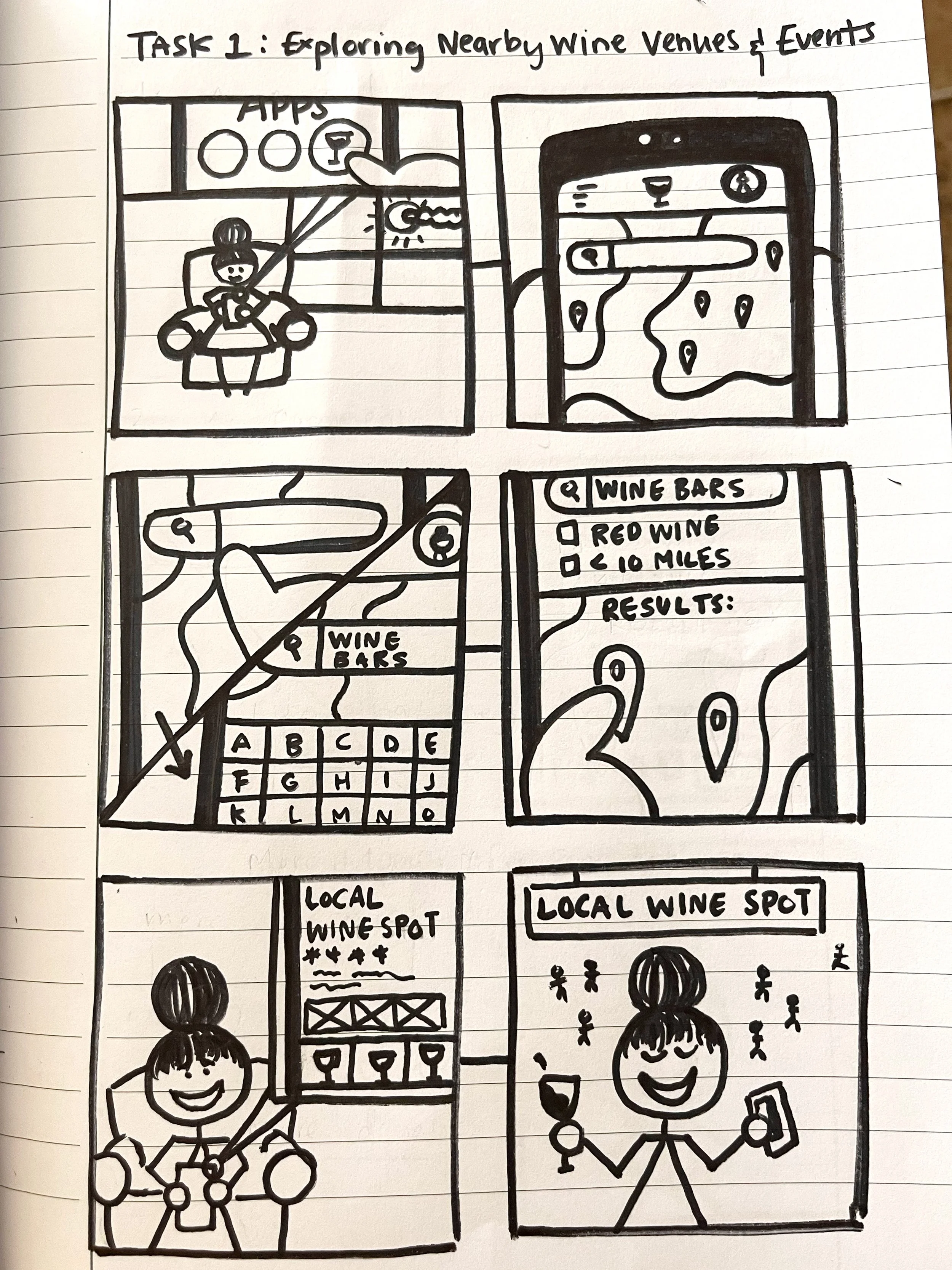

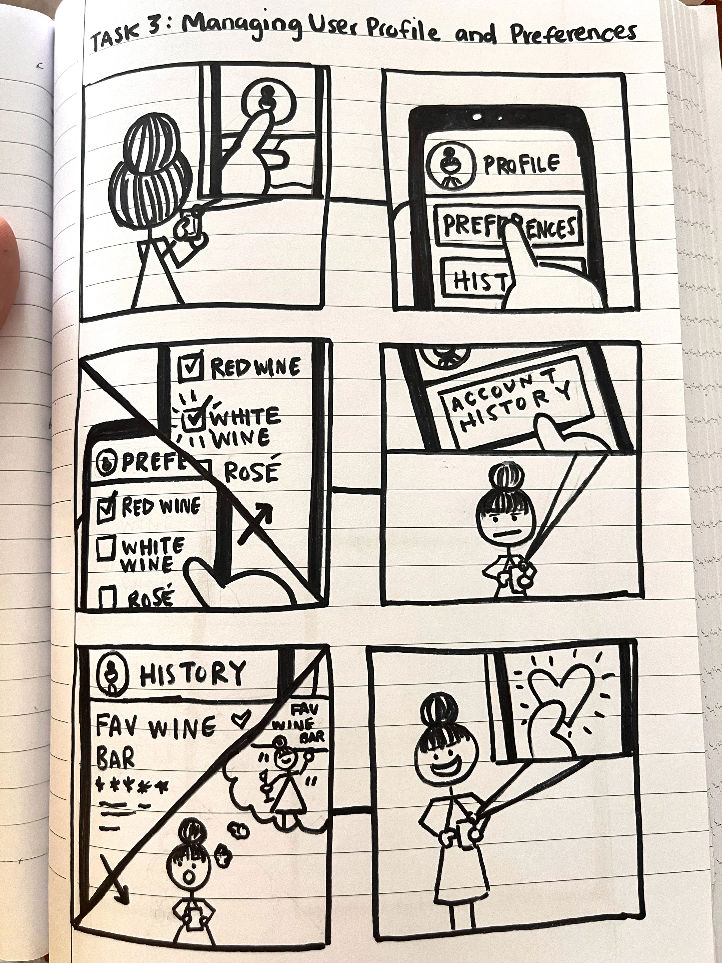
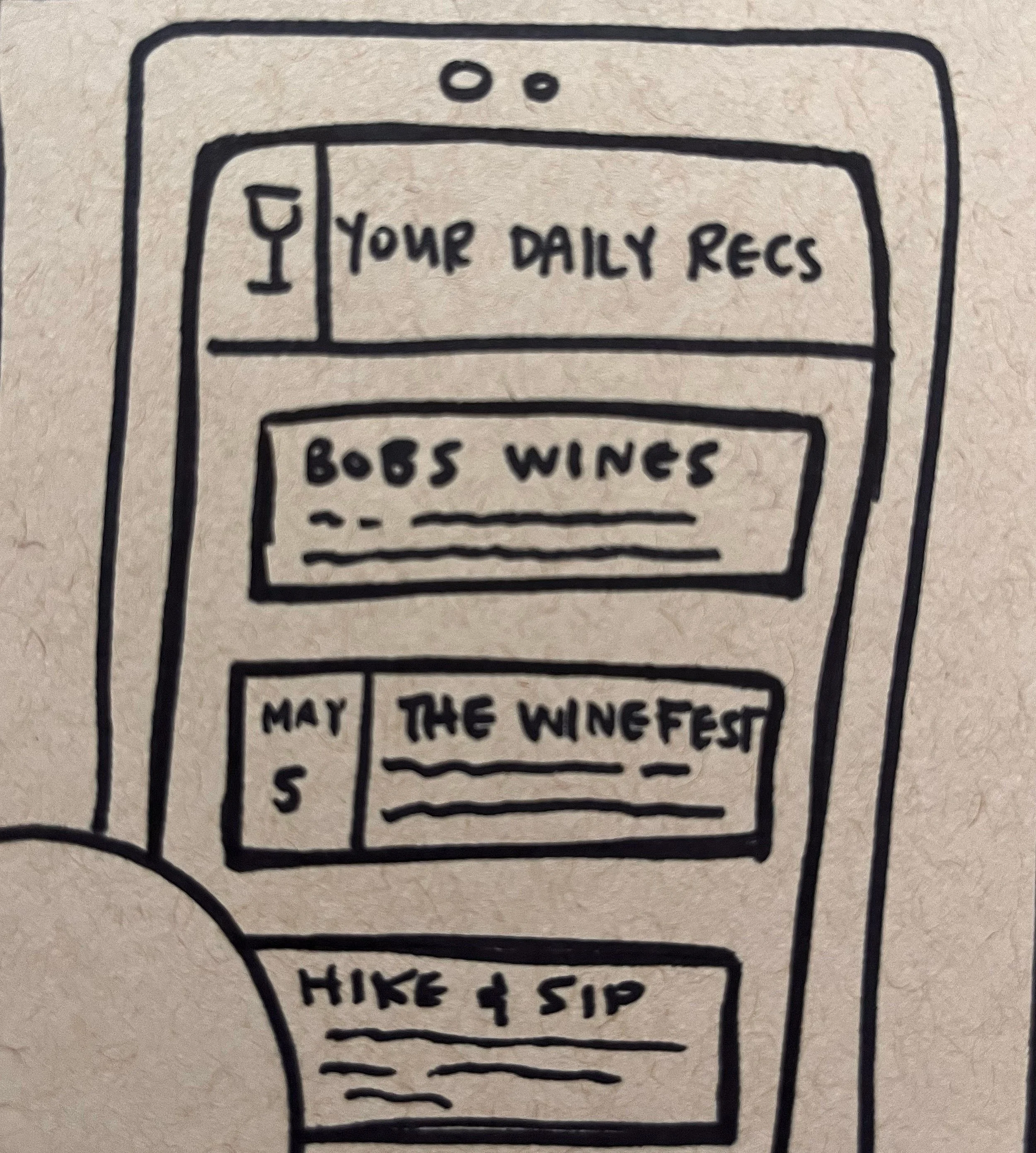
Based on the storyboard and user feedback, I began shaping the initial interface sketches, focusing on how each screen would guide users through discovery and personalization with minimal friction. These early concepts formed the foundation for the UI development phase, where visual structure and interaction patterns were refined to align more closely with users’ mental models.
Design Phase
With a clear concept defined, I moved into visualizing and refining the Wine Fix experience. This phase focused on translating sketches into tangible interfaces — shaping structure, interaction, and aesthetic flow through iterative prototyping and feedback.
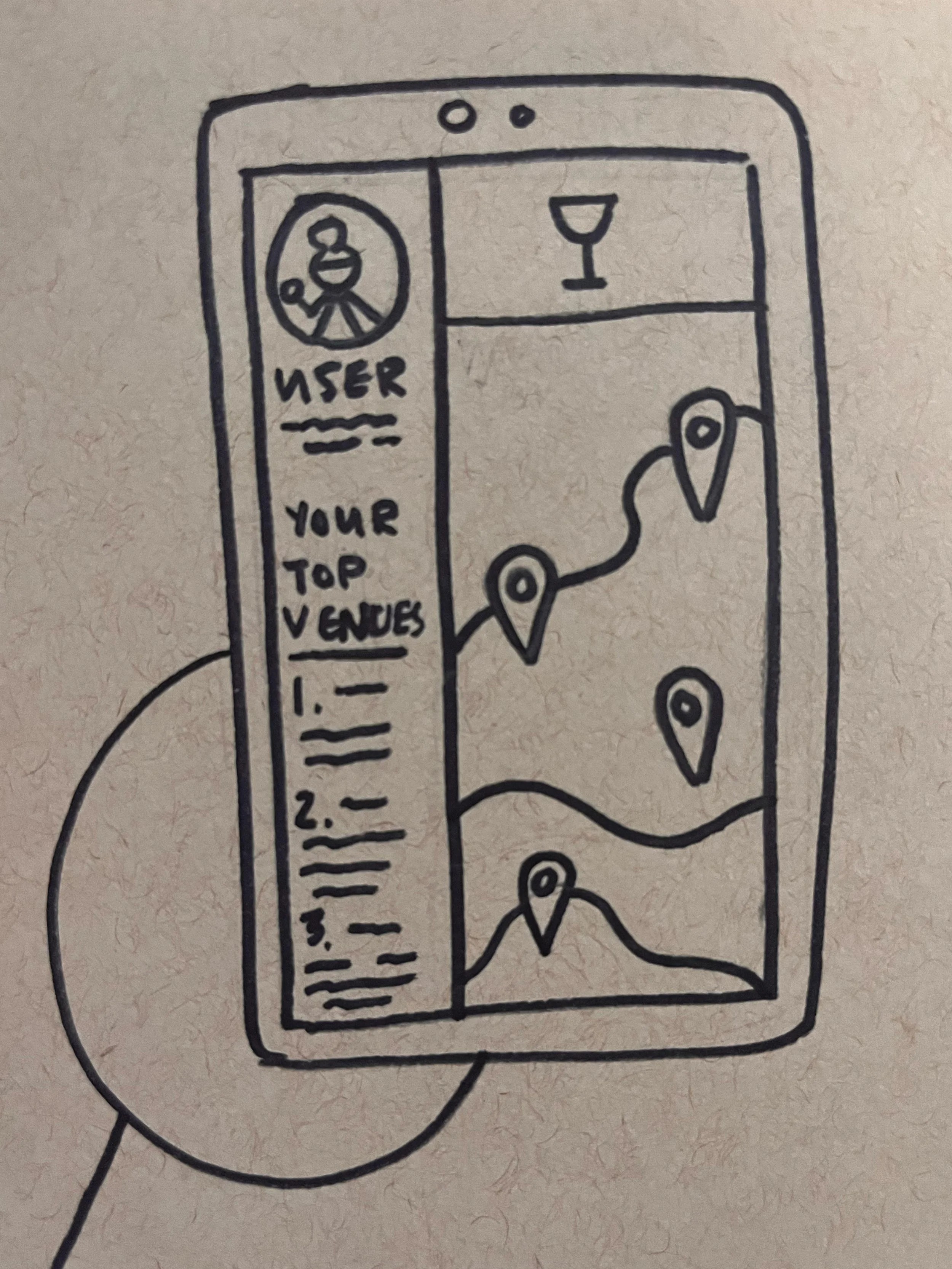
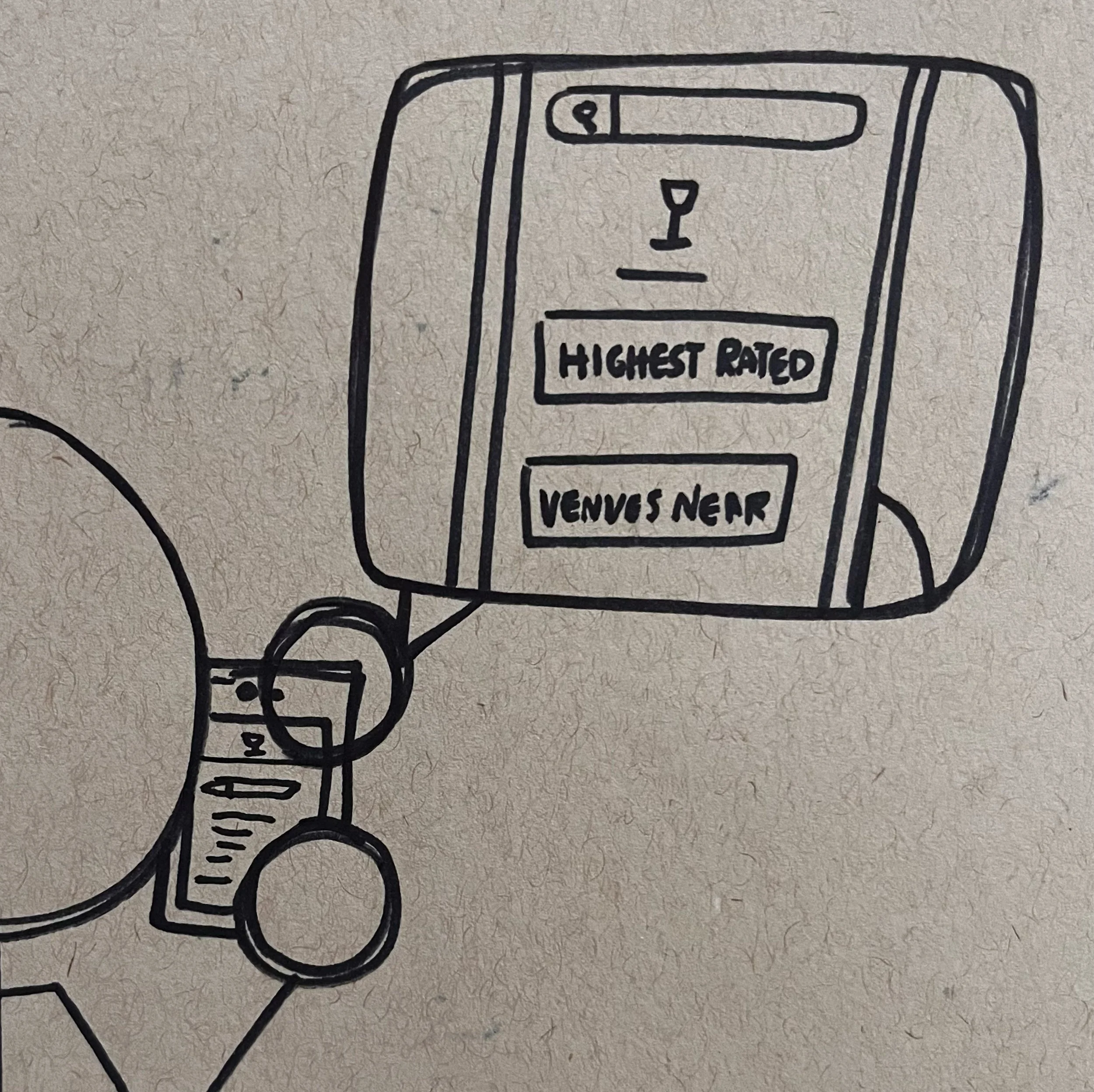
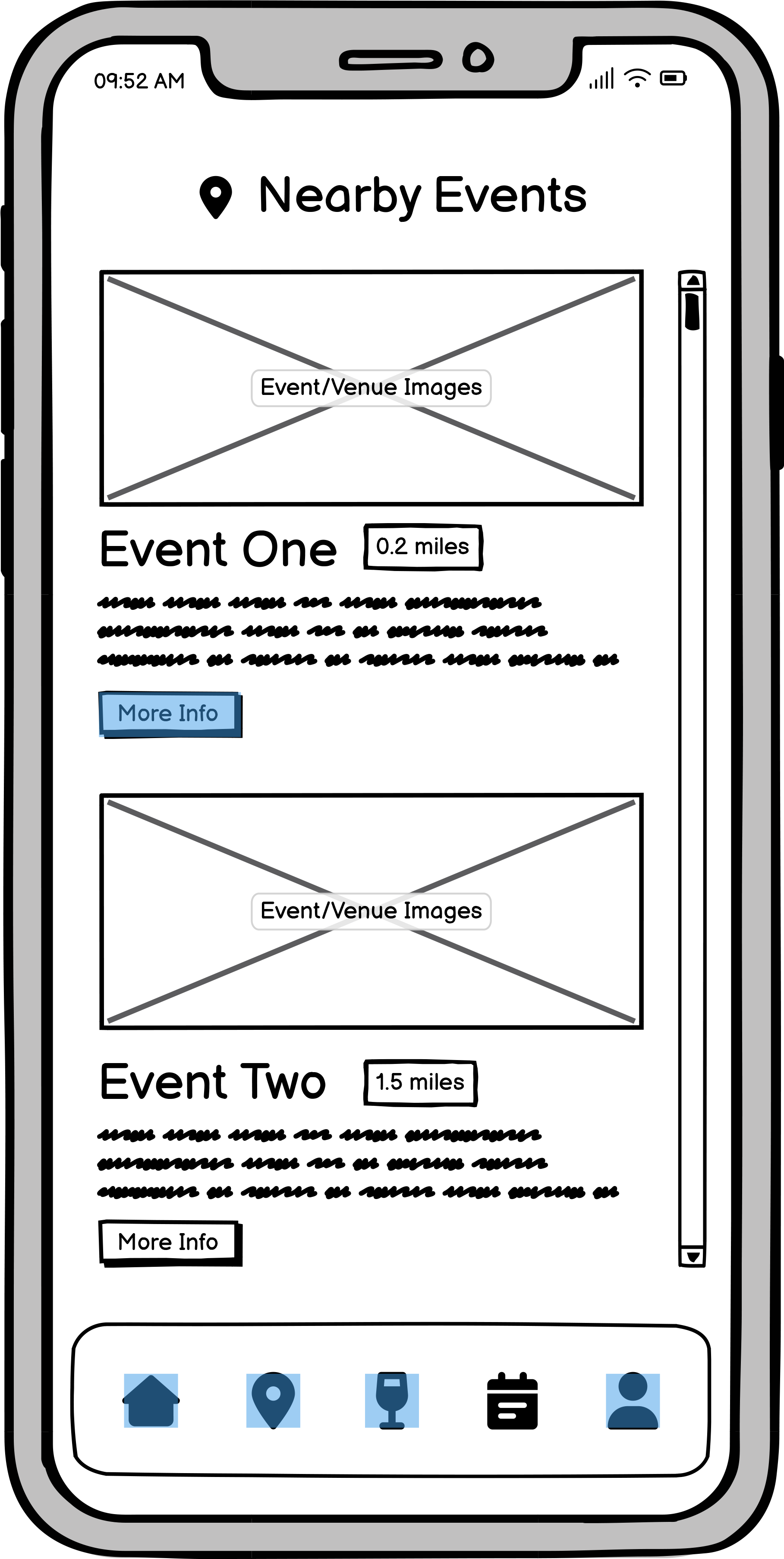
Medium Fidelity Prototype
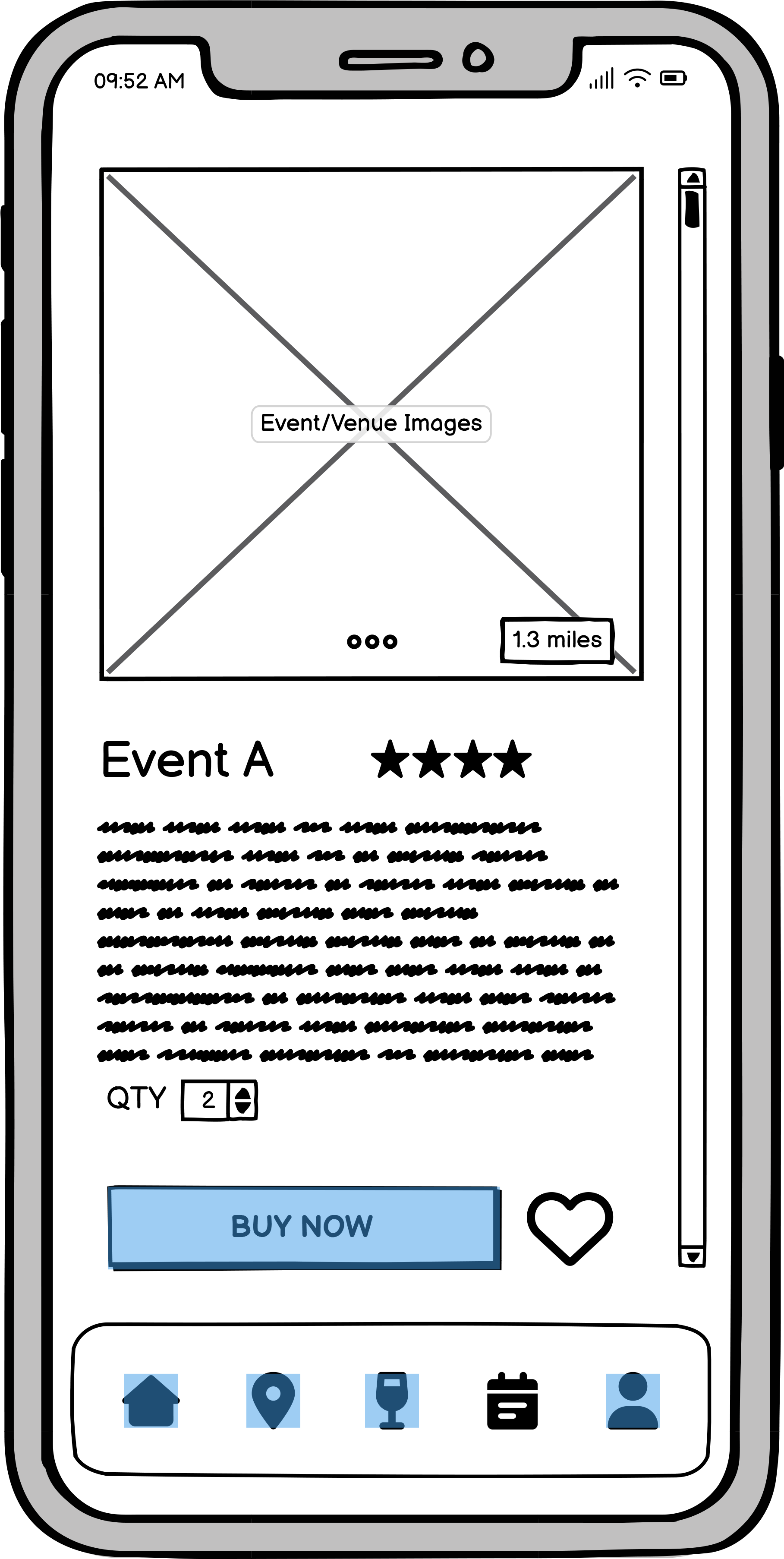
Building on the refined sketches, I developed a paper prototype to test basic navigation and task flow. Insights from this quick, low-fidelity round helped shape the medium-fidelity digital prototype, where layout and functionality began to take clearer form.
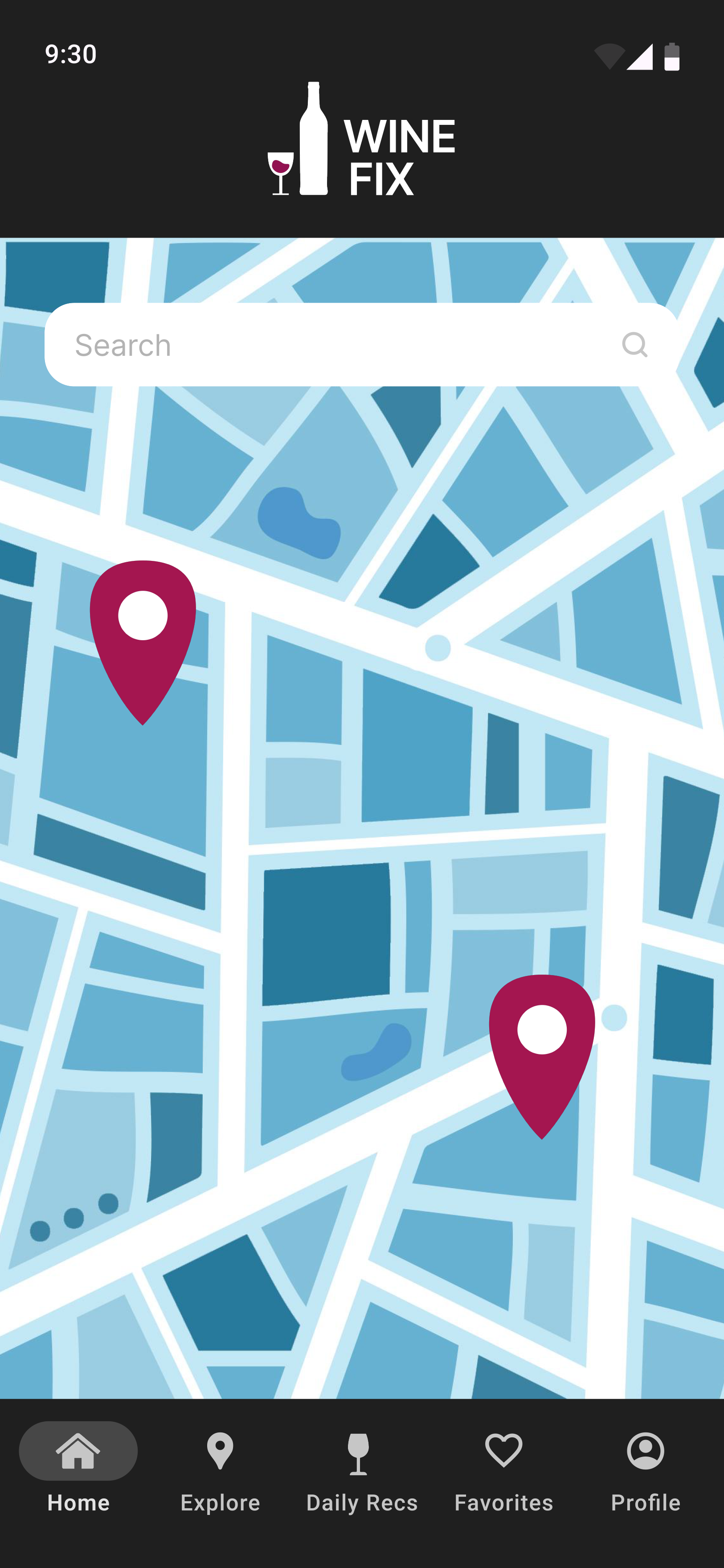
Home Screen
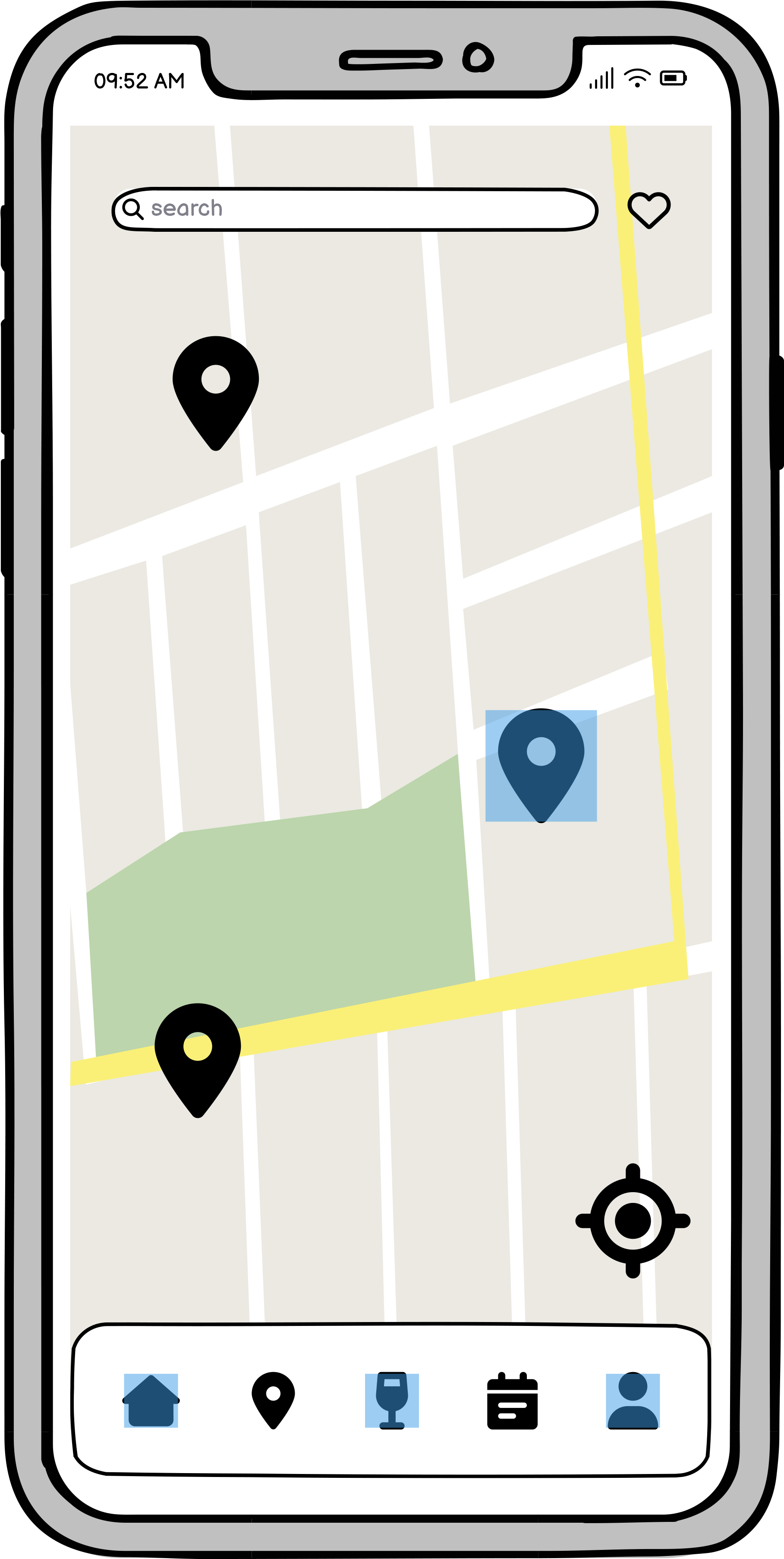
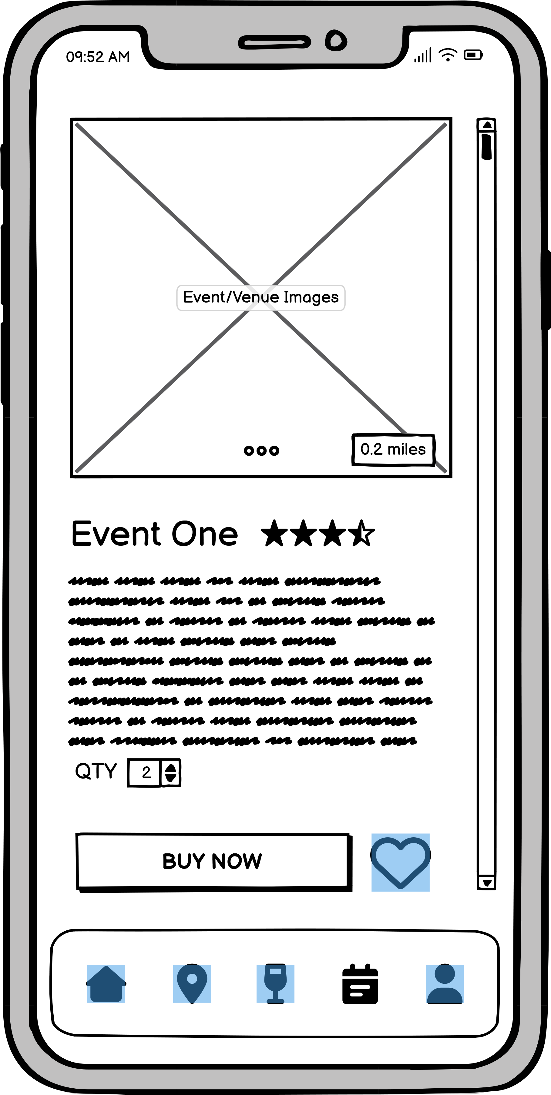
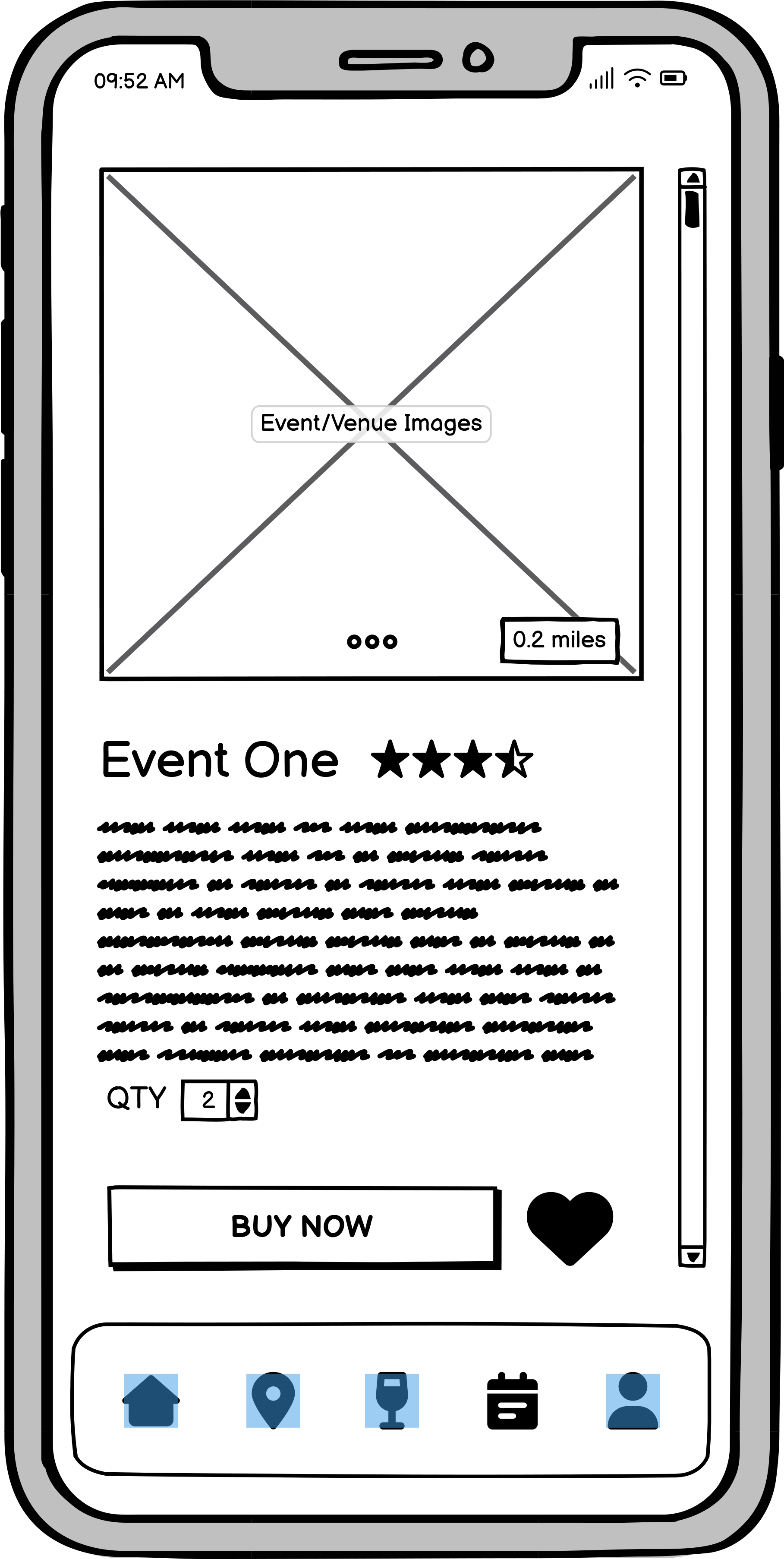
Nearby Events Screens


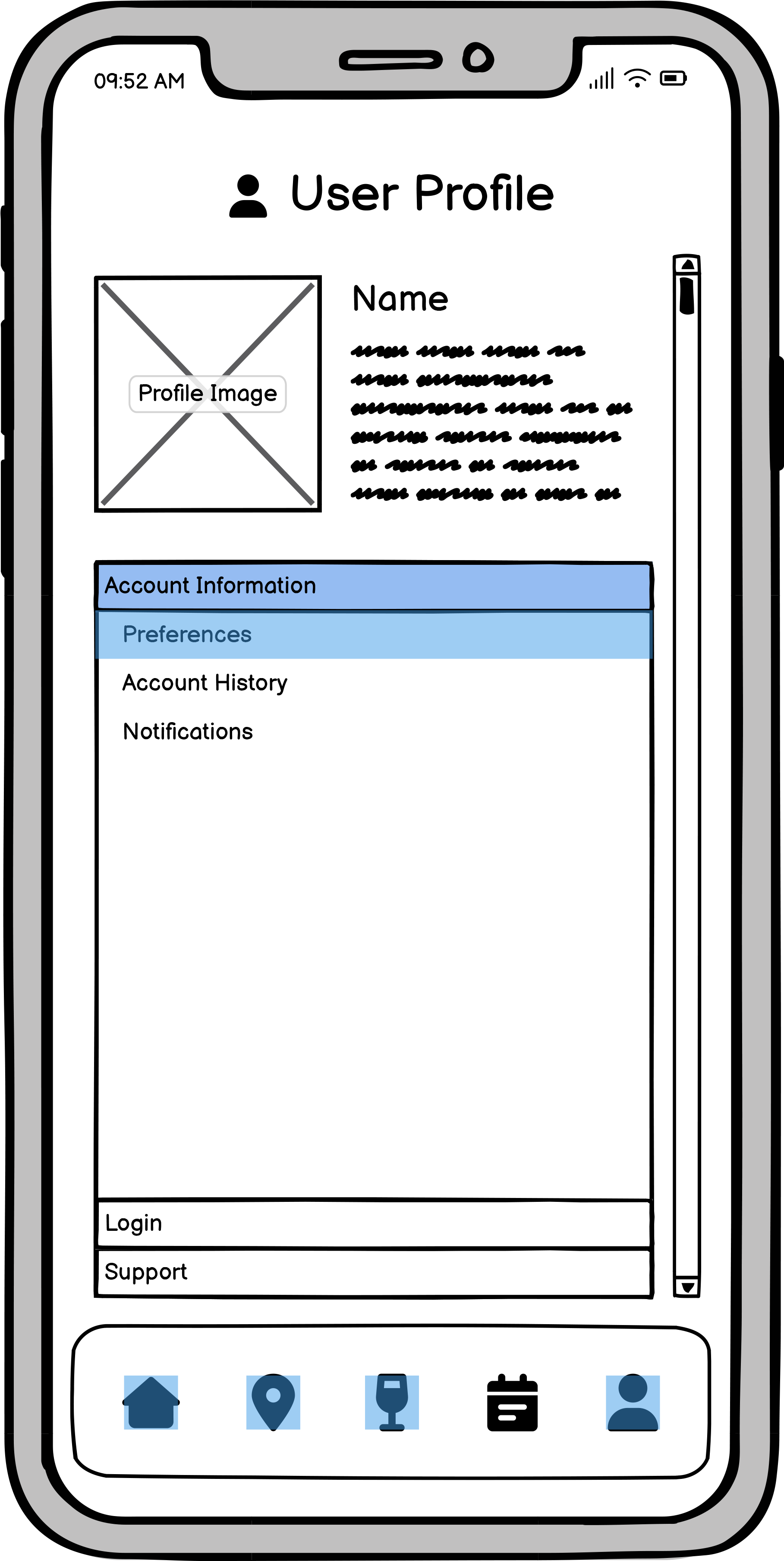
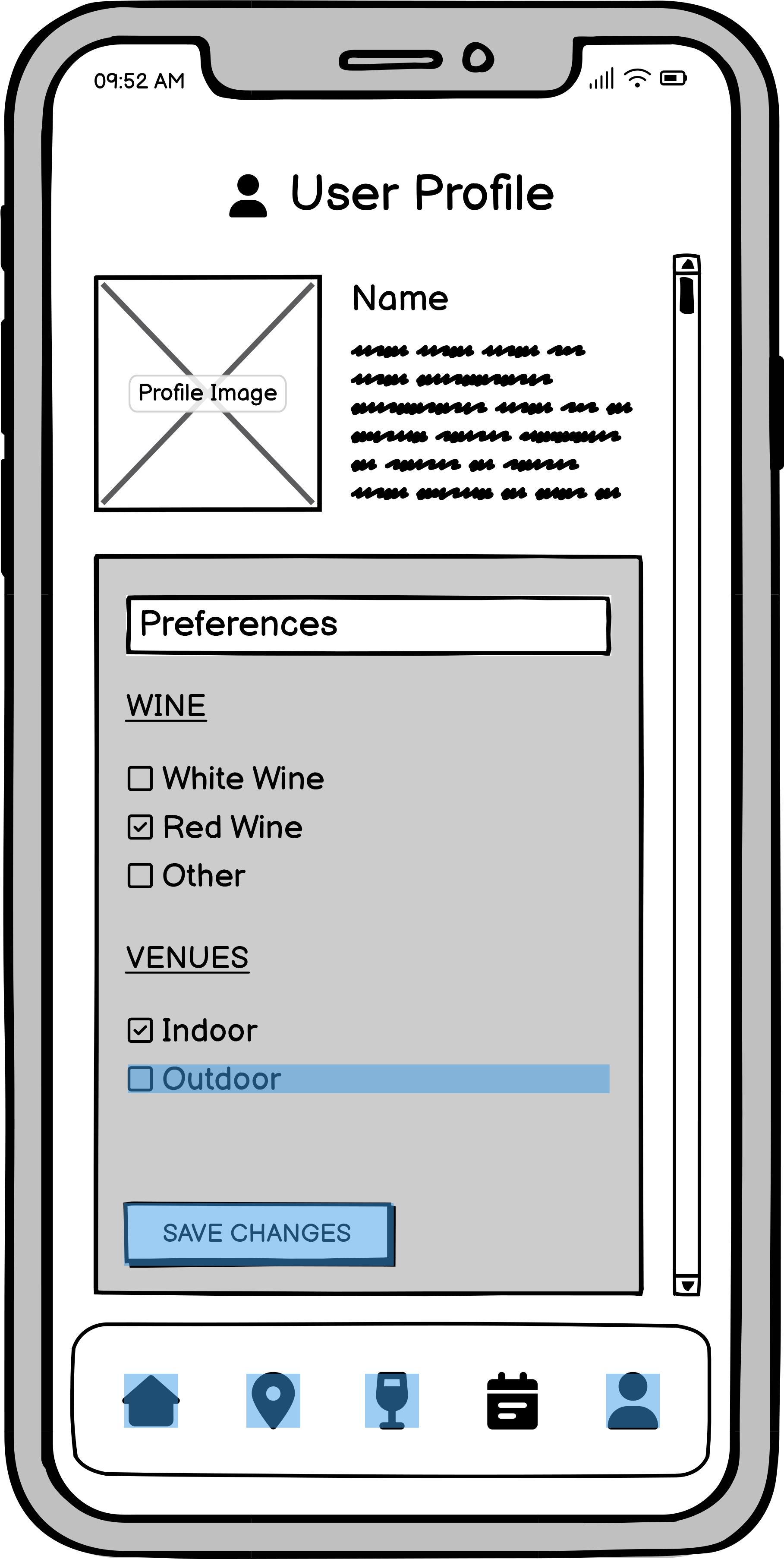
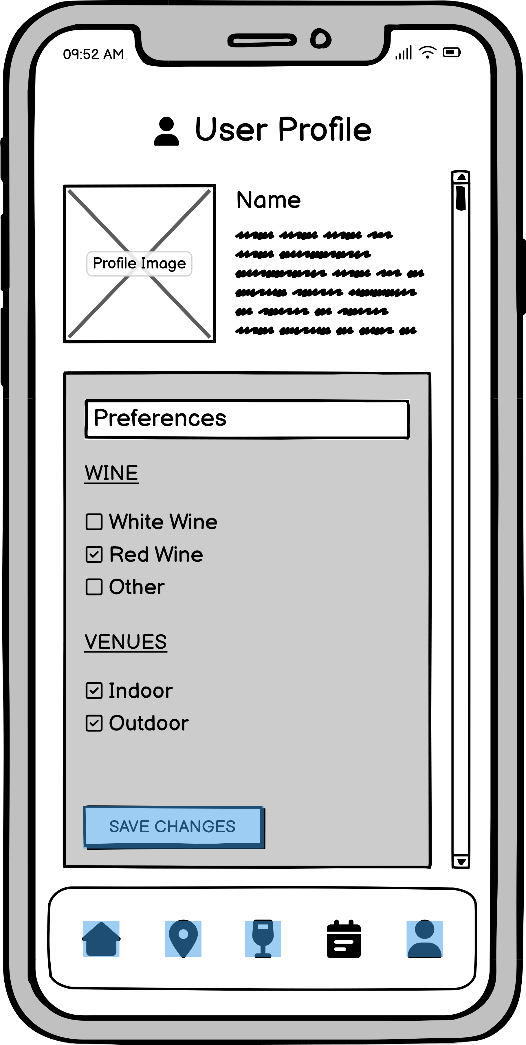
User Profile Screens
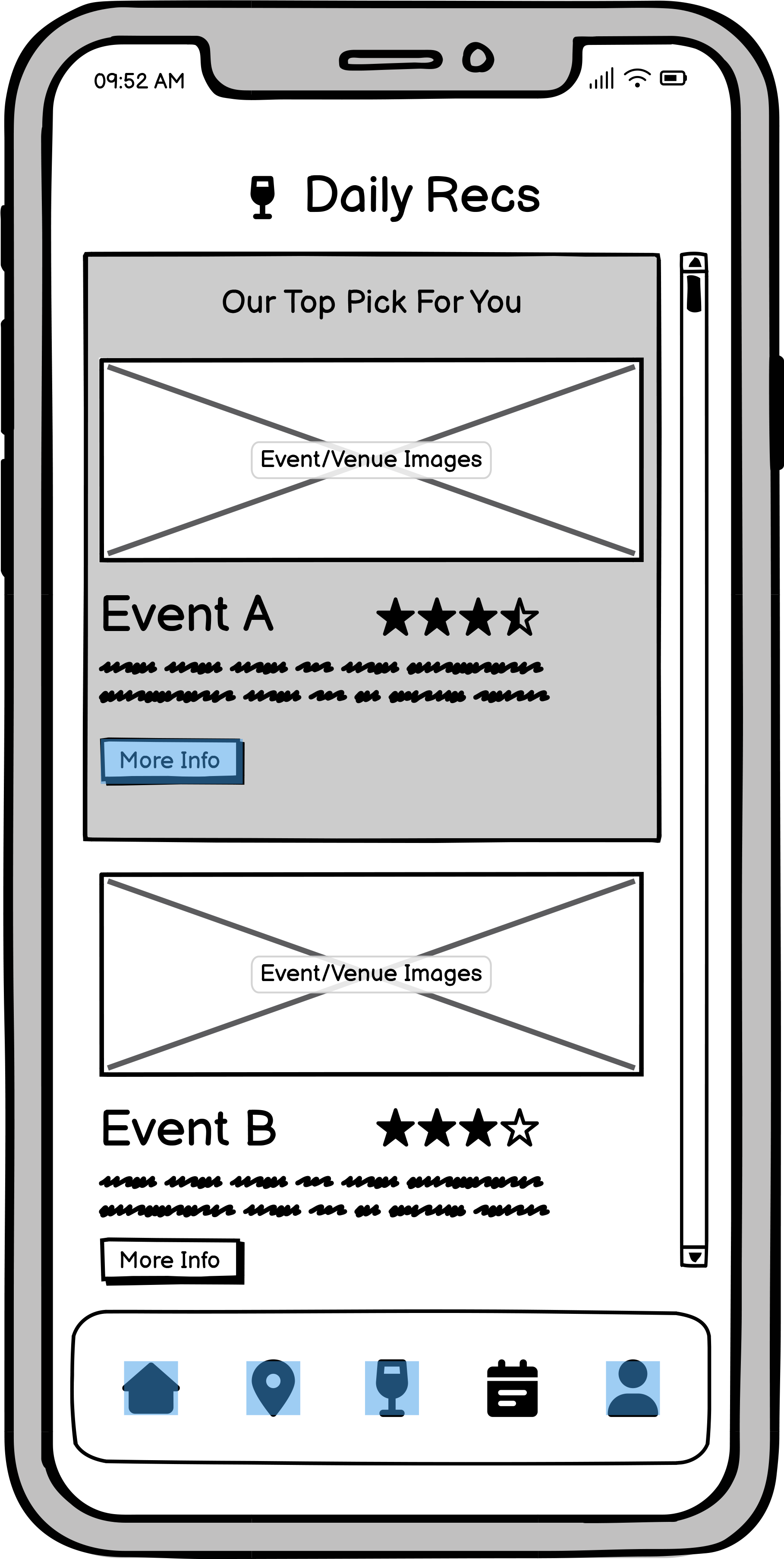
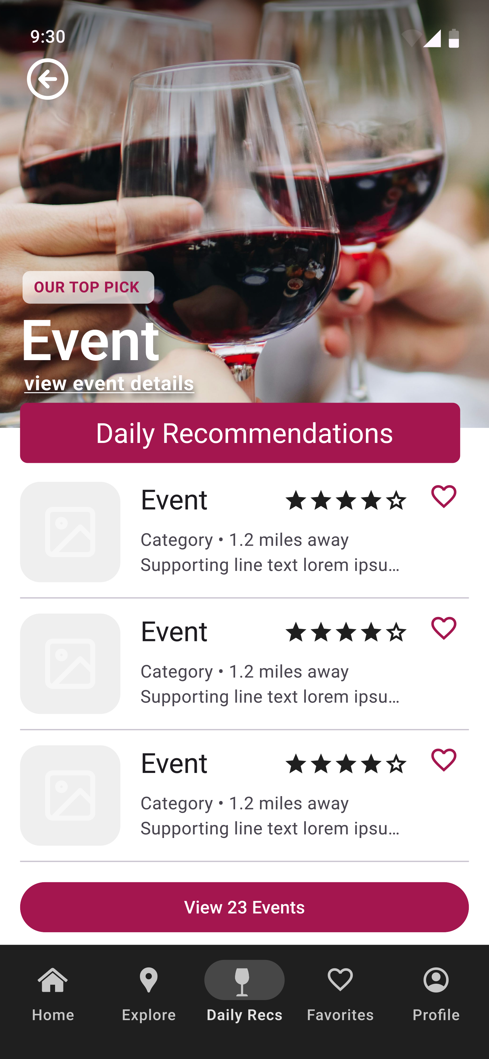
Daily Recommendations Screens
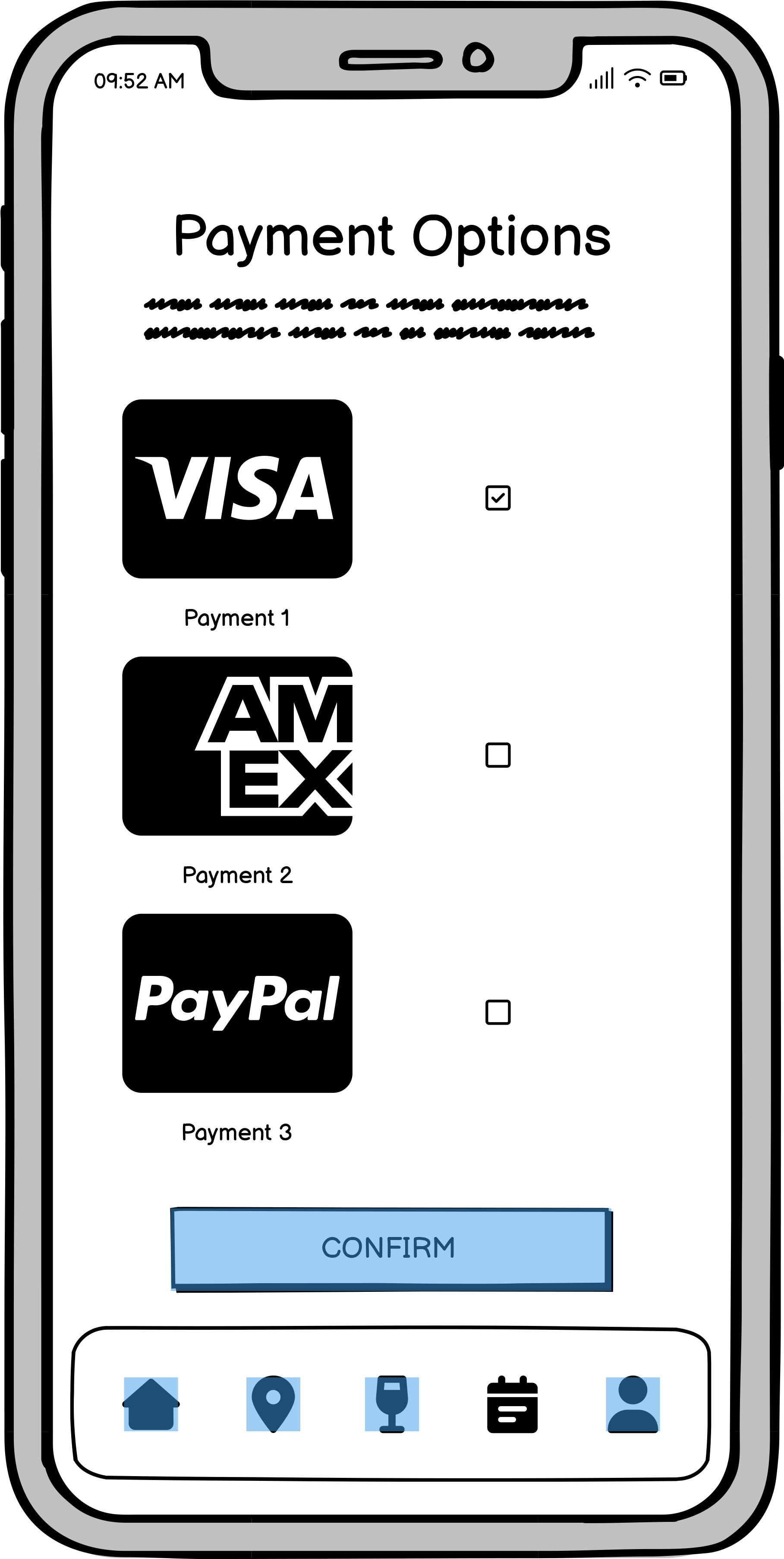
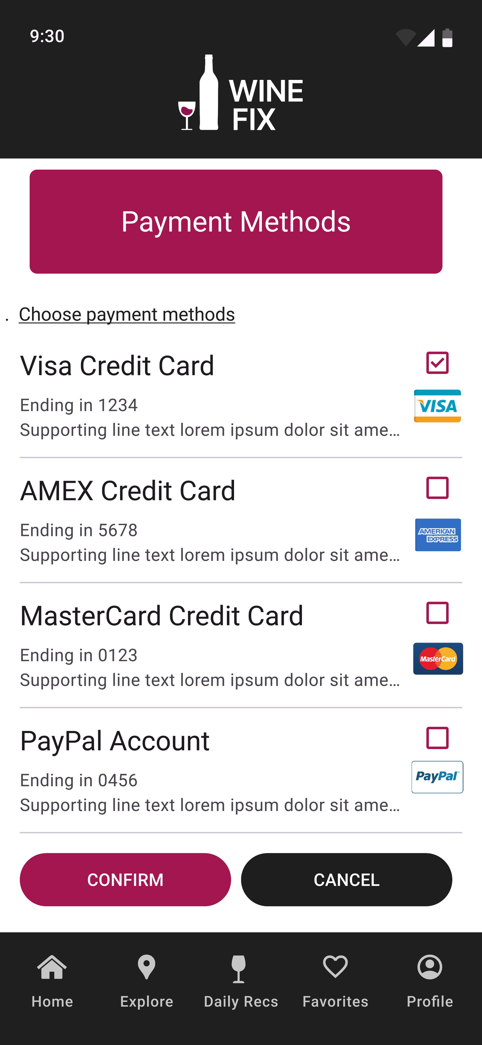
Payment Screens
A heuristic evaluation helped identify usability gaps before finalizing the interface. Common issues included minor labeling inconsistencies and overly dense event listings. Refinements focused on clarity, consistent feedback, and reducing cognitive load during navigation.
Hi Fidelity Prototype
The final high-fidelity prototype captures the full WineFix experience — blending intuitive navigation with a clean, modern interface that celebrates community and discovery. Designed in Figma, the prototype reflects a seamless journey from concept to execution, with a focus on clarity, warmth, and usability.
Test Phase
To evaluate the effectiveness of the Wine Fix prototype, I conducted usability testing to understand how users interacted with the core flows — discovering venues, reviewing recommendations, and saving favorites. The goal was to assess clarity, ease of use, and overall satisfaction.
Usability Test Plan
Defined objectives, target users, and key tasks to evaluate overall navigation and clarity.
Testing Script
Created structured prompts guiding participants through core actions such as exploring events and managing preferences.
Results & Insights
Observed that users responded positively to the visual layout and navigation flow, noting particular appreciation for the event map and personalized recommendations. Minor feedback included requests for clearer labeling and more visible event filters, which informed final refinements.
Overall, the usability feedback validated the app’s core structure and confirmed its potential to make wine exploration more intuitive and community-driven.